 |
||||||||||
extras: sailor moon site spotlightsSite for Review: Serenitatis.com | December 09, 2012Serenitatis.com is one of the oldest Sailor Moon sites that still exist today. It is from a class of the Original Sailor Moon sites that came up in the 90s, many of which sadly no longer exist. Serenitatis.com is run by a girl named Danielle, also owner of the beautiful Tsukino Usagi shrine Serapii-kisu.net. It is purely an image galleries centered site - and a brilliant one at that. 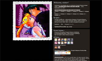 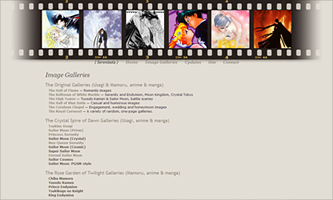 LayoutThe layout for Serenitatis.com is simple and functional and yet lovely as well. It uses two designs: a "splash" page of sorts and then the main layout used for the content of the site. Upon coming to the site, one is greeted by a simple layout in table format, with an image on the left and the introduction content on the right. However it is all very smartly put together and comes across as professional and not at all lacking. The image features a beautiful anime Sailor Moon & Tuxedo Kamen image framed in an elegant border and the site's title. I usually find splash pages useless but Danielle has expertly constructed the information she wishes to provide to the visitor: links to the new Kodansha manga, a list of her affiliates and special mention to two classic Sailor Moon sites that have retired; and then a quick link to her main content, the image galleries. The page is dark and classy, using a black and grey scheme with the background and text, and cleverly complimented by splashes of color found in the affiliate buttons, link buttons and image. The next layout used is for the image galleries and site content. Once again it remains simple yet properly constructed. The banner-header approach is unique in the sense that it is formed as a film strip. Danielle uses her favorite Usagi & Mamoru images placed atop a film strip that fades on both ends. Once again she uses somber colors highlighted by pops of colors in the images. The page conveys itself as professional and elegant by grey-lavender background and image gallery links. Delicate and functional font are paired together for easy understanding and a pleasant appearance. 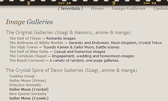 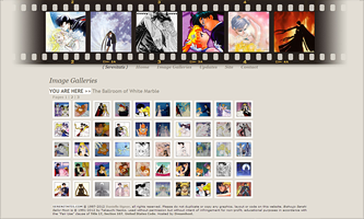 OrganizationFor a site that is stocked full of images, organization is key here. And Danielle does so with perfect detail and attention. Serenitatis.com hosts just about every Usagi/Mamoru related image in existence in a way that is very easy for the visitor to understand. But it is also done in a tasteful and playful way. The galleries are comprised in individual categories that are offered on a single page. The Anime & Manga galleries are offered first. Usagi & Mamoru, which are separated in enticing categories of romance, casual, royalty, etc - each with a special title. Next comes Usagi, in all of her forms and then Mamoru as well. Images from the live action PGSM and Sera Myu series are also offered, each having a separate gallery per person, pairing and form. Also offered are doujinshi images and adorable sprites. And as a special touch, Danielle offers a "carousel" gallery, which features one page galleries of specific scenes involving Usagi and Mamoru (such as battles fought, first meetings, the morning after, etc). Possibly the most important element of what makes this site so successful is that Danielle makes sure for speedy loading time. She keeps the thumbnails as tiny squares and in jpeg format so they load instantly without making the visitor have to wait for the images to load and thus being able to quickly view the next page of images. It is an absolute plus and incredibly important for the success of a website. 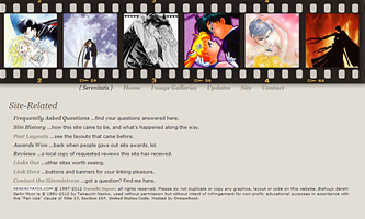 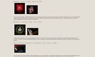 ContentThere are pros and cons on this subject. Allow me to start with the pros. Serenitatis.com has the main purpose of being a image-centered site and it excels in this manner. Images from the manga, magazines, posters, anime screencaps, opening scenes, artwork, doujinshi, PGSM and Sera Myu (etc) are featured here and it is a godsend to any Sailor Moon fan. Even to this day I visit this place if I am looking for new images because she features images from every scene and they remind me of what I have forgotten. The only set back is that the intent is quantity over quality. Since every available image has been used to stock this site, many of the images are not usable for graphic makers, so this is not the place to visit if you are looking for resources to use. However, what makes up for this disadvantage is that this site is the starting point for anyone who is searching to see what kind of images are out there. So I think the pros and cons even each other out. There are a few extra pages other than galleries. One can also view the layout history of Serenitatis.com, which is very exciting because this site offers 15 years worth of layouts. A lot! So it is fun to see how the site has changed over time. There are also the usual site information pages such as updates, faqs, linkage, etc. All of them worth a visit. Final ThoughtsLayout: 8Organization: 10 Content: 10 In conclusion, this Sailor Moon site is really in a class of its own. I know that for me personally it was the site that changed my Sailor Moon experience, because it informed me that other forms of Sailor Moon existed - not just the anime. I learned about the manga, that Mamoru was handsome and romantic, that Usagi was an elegant and strong woman, beautiful artwork existed, Sera Myu and PGSM... it was amazing. And I am forever grateful to this website. The Sailor Moon fandom is incredibly fortunate that Serenitatis.com remains and survived the Sailor Moon Drought and did not die along with the other Original Classic BSSM websites. -- Rebecca (vomitdirt)
|
||||||||||


